Using a chart in Excel makes a table more readable and especially to identify key figures in a few seconds. In this tutorial we will add a legend to our graph, but also customize the appearance of the legend, including the font, and its color.
Label a chart in Excel
- Click on the graph to which you want to add a caption, click the Chart Elements button + And click Legend.
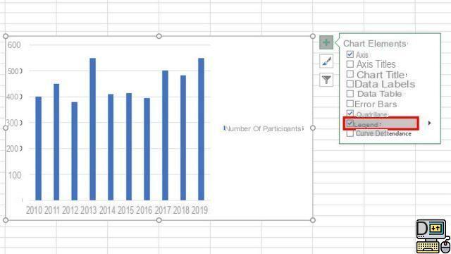
- To change the position of the legend, click on the arrow to the right of the legend, then select the desired location.
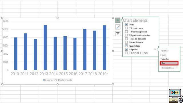
By default, a legend is not allowed to overlap a chart. But if you're short on space, it's possible to reduce the size of the graph by clicking on More options, then unchecking the box Show legend without covering the graph.
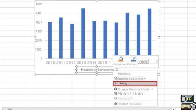
To delete a caption, right-click it, then click Delete
Change the font or size of legends in an Excel chart
- Click with the right button of your mouse on the legend, then click Police.
- In the Font tab, make any desired changes like font size or color.
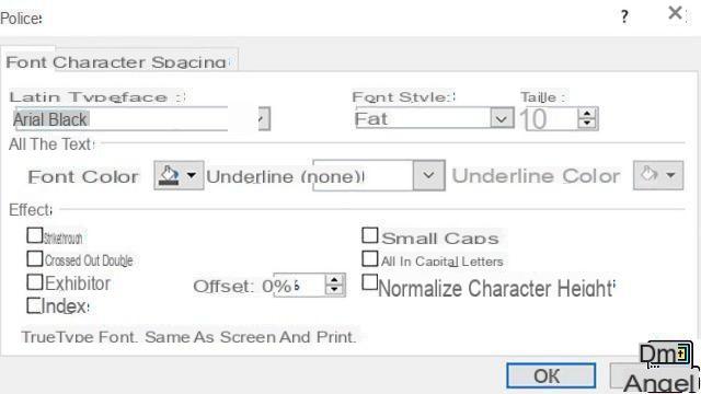
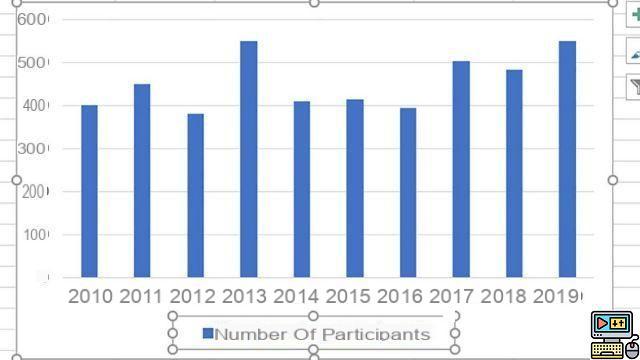
- When finished, press the button Ok to see the result on your Excel spreadsheet.
The legend of a graph may seem trivial to you, but it is an essential element of the representation. Excel allows you to highlight your legend by adding an effect to it: shadow, glow, softened outline, etc. Be careful not to overload the legend to the detriment of your graph!
40 ">This tutorial is brought to you by the trainer Jean-Philippe Parein
Find his course Learn and Master PowerPoint Complete Guide
in full on Udemy.